
Learning how to change default font in outlook can save you a lot of time and make every email look clean and professional without extra formatting. By default Outlook uses Calibri in size 11, which works fine but may not match your personal style or company branding. When you set your own default once, every new message, reply, and forward automatically starts with the font you prefer.
If you send dozens of emails every day, manually changing the font each time is frustrating and inconsistent. A custom default helps you maintain readability, reflect professionalism, and ensure your messages are accessible on both desktop and mobile devices. It is especially useful for business owners, freelancers, and teams that want a consistent email appearance.
In this complete guide, you will learn exactly how to change default font in outlook on Windows, Mac, and the web version. We will cover step by step instructions for new messages, replies, plain text messages, and signatures. You will also discover the best fonts to use, common mistakes to avoid, and how to fix settings that do not save correctly.
Whether you prefer Arial for clarity, Verdana for accessibility, or your brand font for marketing, this article will show you the easiest and most reliable way to do it. By the end, you will have a perfectly formatted Outlook setup that saves time and improves how recipients perceive your emails.
Outlook has used Calibri as its default font for many years because it is modern, compact, and easy to read on screens. Microsoft chose it to replace Times New Roman for digital communication. While Calibri is neutral and safe, it does not suit everyone, and many professionals want something that feels more formal, friendly, or on brand.
Changing your default font is different from changing the font for one email. When you change it for one email, the setting applies only to that message. When you change the default, Outlook remembers your choice and applies it automatically to all future messages until you change it again. This is why it is such a powerful productivity setting.
Outlook actually lets you set three separate defaults for compose scenarios. You can choose one style for new email messages, another for replying or forwarding, and another for composing and reading plain text messages. Understanding this separation helps you create a flexible setup that looks good in every situation.
Many people do not realize that Outlook on the web, Outlook for Mac, and the new Outlook for Windows have slightly different menus. The concept is the same everywhere, but the buttons are in different places. Once you understand the logic behind stationery, signatures, and mail format options, you can quickly adapt to any version.
Setting the right default font also affects accessibility and professionalism. A clear sans serif font with adequate size and good color contrast is easier to read for older recipients and people with vision difficulties. It also prevents embarrassing situations where your email looks unprofessional or inconsistent with the rest of your business communication.
Why Does Outlook Use Calibri As Default?
1. Improved Screen Readability For Long Emails
Calibri was designed specifically for screen reading with soft rounded letters and generous spacing that reduce eye strain during long email sessions. Microsoft selected it because it remains clear even at small sizes and on low resolution displays. However, if you prefer a wider font like Verdana or Arial, learning how to change default font in outlook lets you keep that readability benefit while matching your own comfort and visual preference.
2. Professional And Neutral Business Appearance
Calibri looks modern without being too casual or too formal, which makes it a safe default for millions of business users around the world. It does not distract from the message content and works well for both short replies and detailed reports. Still, many companies require Arial, Georgia, or a custom brand font for consistency, so changing the default ensures every employee represents the business correctly without manual formatting.
3. Compact Design That Saves Space In Threads
One reason Outlook keeps Calibri is that it is relatively narrow, so more words fit per line without making paragraphs look crowded. This is helpful in long email threads and on mobile devices where screen width is limited. If you switch to a wider font, you may need to increase line spacing or use a slightly smaller size to maintain the same clean layout and avoid excessive scrolling for your readers.
4. Consistency Across Microsoft Office Applications
Outlook shares its default font logic with Word, Excel, and PowerPoint to create a unified Microsoft 365 experience. When you write an email, it feels similar to writing a Word document, which reduces the learning curve for new users. The downside is that your emails may look identical to everyone else, so customizing the default helps you stand out while still enjoying the familiar Office editing tools and spell check features.
5. Better Compatibility With Different Email Clients
Calibri is widely available on Windows and Mac systems, so most recipients will see your message close to how you intended. When you choose a rare or decorative font, the recipient system may substitute it with something else and ruin your layout. That is why experts recommend sticking to web safe fonts like Arial, Calibri, Verdana, Georgia, and Tahoma when you customize your Outlook default for external business communication.
6. Accessibility Support For Diverse Readers
Sans serif fonts like Calibri are generally easier for people with dyslexia and low vision to read compared to complex serif fonts. Microsoft prioritized accessibility when choosing the default, including good distinction between similar characters like capital I and lowercase l. If your audience includes older clients or people using screen magnifiers, you might want an even more accessible choice like Verdana in size 11 or 12 as your permanent default.
7. Personal Branding And Custom Preference Needs
Even though the standard default works well, it does not reflect personal taste or company identity. Freelancers, marketers, lawyers, and executives often want a signature style that feels more authoritative or friendly. Knowing how to change default font in outlook gives you full control over size, color, and bold styling, so every new message automatically aligns with your personal brand without extra clicks or formatting effort.
Steps To Change Default Font In Outlook
1. Open Outlook desktop on Windows, click File in the top left corner, then choose Options, then select Mail from the left sidebar to access compose settings for all new messages.
2. Click the Stationery and Fonts button under the Compose messages section, which opens a separate window where you can customize fonts for new mail, replies, and plain text.
3. Under New mail messages, click Font, then choose your preferred font family, style, size, color, and effects, and click OK to preview how it will look in future emails.
4. Under Replying or forwarding messages, click Font and select the same font or a slightly different style, such as blue color or italic, so replies are easy to distinguish in long threads.
5. Under Composing and reading plain text messages, click Font to set a simple readable option like Arial or Consolas, because plain text does not support rich formatting or embedded styles.
6. Click OK to close the font windows, then click OK again to save your Outlook options, and create a new email to verify that your chosen default appears automatically.
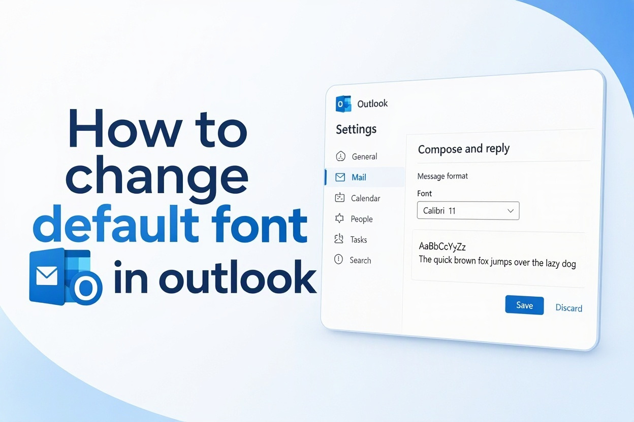
7. On Outlook for Mac, go to Outlook Preferences, choose Fonts, and set your defaults there, while on Outlook on the web, open Settings, then Mail, then Compose and reply to update the message format defaults.
Best Fonts For Professional Outlook Emails
- Calibri: Calibri remains a solid choice for everyday business emails because it is clean, modern, and familiar to most Outlook users. Use size 11 or 12 with black or dark gray color for best readability across desktop and mobile devices.
- Arial: Arial is one of the most universal sans serif fonts and displays consistently in almost every email client. It looks slightly wider than Calibri, so it feels formal and is excellent for legal, finance, and corporate communication.
- Verdana: Verdana was designed for small screen text with wide letter spacing and tall lowercase letters. It is ideal if your readers are older or often check email on phones, and size 10 or 11 usually provides excellent clarity.
- Georgia: Georgia is an elegant serif font that works well for professional newsletters, consultancies, and academic emails. It conveys trust and tradition while remaining highly readable on screens when used at size 11 or larger.
- Tahoma: Tahoma is compact yet very clear, making it perfect for users who send long detailed emails and want to save vertical space. It maintains sharp edges at small sizes and looks professional in both new messages and replies.
- Trebuchet MS: Trebuchet MS offers a friendly and contemporary feel without looking casual or unprofessional. It is a great middle ground for creative businesses, startups, and customer support teams that want warmth plus readability.
- Segoe UI: Segoe UI is the modern Windows system font with a clean humanist design that pairs well with Microsoft 365. It looks polished in Outlook signatures and branding, especially when combined with dark blue or charcoal text color.
How To Fix Outlook Default Font Problems
1. Default Font Resets After Restarting Outlook
If your custom font keeps reverting to Calibri after you restart Outlook, the issue is often caused by a roaming profile, group policy, or corrupted normal email template. First, repeat the Stationery and Fonts steps and ensure you click OK on all windows. If the problem continues, ask your IT administrator whether a company policy is forcing a standard font, and try repairing your Office installation through the control panel.
2. Reply Font Looks Different From New Message Font
Many users set the new message font but forget to update the replying and forwarding font separately, which causes inconsistent appearance in threads. To fix this, open Stationery and Fonts again and set both sections to matching families and sizes. Using a slightly different color for replies, such as dark blue, can actually improve clarity while keeping the overall style consistent and professional for recipients.
3. Font Changes Do Not Apply To Plain Text Mode
Plain text messages ignore bold, color, and many font families by design for maximum compatibility and security. If your default looks wrong only in plain text, that is expected behavior. Go to the plain text font setting and choose a simple fixed option like Arial 10 or Consolas 10. For full styling control, make sure your default compose format is set to HTML rather than plain text or rich text.
4. Custom Font Does Not Display For Recipients
When you use a rare font that the recipient does not have installed, their email client will substitute it with Arial or another fallback, making your design look broken. To avoid this, stick to web safe fonts that are preinstalled on Windows, Mac, iOS, and Android. Test your emails by sending them to yourself on Gmail and mobile before rolling out a new default across your team or client base.
5. Signature Font Overrides Your Default Settings
Outlook signatures have their own formatting that can override your default message font if they were pasted from Word or a website with hidden styles. Edit your signature in the signature editor, select all text, and reapply your chosen font and size manually. This ensures the body and signature match perfectly and prevents mixed fonts that make emails look unprofessional and carelessly formatted.
6. New Outlook For Windows Missing Classic Options
The new Outlook for Windows uses a simplified web based settings panel instead of the classic File Options menu, which confuses longtime users. Click the gear icon, choose Mail, then Compose and reply to find the message format section. Set your font, size, and color there and save changes. If you switch between classic and new Outlook, you will need to configure the default separately in each version.
7. Stationery Theme Prevents Font Customization
If you previously applied an Outlook stationery theme with background images or decorative headers, it may lock your font choices and prevent changes from showing. Open Stationery and Fonts, set the Theme to No Theme, then reapply your custom fonts for new messages and replies. Removing heavy stationery also improves loading speed and deliverability, especially for business emails that should focus on clear content rather than decoration.
Learning how to change default font in outlook is a small adjustment that creates a big improvement in your daily workflow. Once you set your preferred style for new messages, replies, and plain text, you no longer need to format every email manually.
Remember to choose a readable web safe font, test it on mobile, and keep your signature matching your body text. If something does not save correctly, check themes, policies, and separate reply settings before trying more advanced fixes.
Take a few minutes today to update your Outlook defaults on desktop, Mac, and web. With a consistent professional look, your emails will be easier to read, more memorable, and better aligned with your personal or company brand.
FAQs About Outlook Default Font Settings
How Do I Change The Default Font Size In Outlook?
Open File, Options, Mail, then Stationery and Fonts in classic Outlook. Click Font under New mail messages and choose your size, such as 11 or 12 for better readability. Save with OK and test with a new email to confirm the size applies automatically.
Why Does My Outlook Font Keep Changing Back To Calibri?
This usually happens due to a company group policy, roaming profile, corrupted template, or active stationery theme. Remove any theme, save settings on all dialogs, and check with IT about enforced policies. Repairing Office can also fix persistent reset issues.
Can I Set Different Default Fonts For Replies And New Emails?
Yes, Outlook lets you set separate defaults for new messages, replies and forwards, and plain text. This is useful for using black for new emails and dark blue for replies. Configure each section individually in the Stationery and Fonts window for full control.
What Is The Best Professional Font For Outlook?
Arial, Calibri, Verdana, and Segoe UI are excellent professional choices because they are clean and widely supported. Use size 11 or 12 in black or dark gray. Avoid decorative scripts and very thin fonts that are hard to read on mobile screens.
How Do I Change Default Font In Outlook On The Web?
Click the gear icon, select Mail, then Compose and reply. Under Message format, choose your font, size, bold, and color preferences. Save the changes and compose a new message to verify. These web settings sync across browsers when you sign in.
Does Changing Default Font Affect My Existing Emails?
No, changing the default only affects future messages you compose after saving the setting. Previously sent emails and drafts keep their original formatting. If you want to update an old draft, open it and manually reapply your new preferred font and size.